Deoji: Logo design for a pet-first accessories brand
Starting a brand is one thing. Starting it with a clear sense of purpose is another. Deoji came to us with something a lot of early-stage clients don't: genuine conviction about what they wanted to stand for. Our job was to translate that into something visual.
How we did it →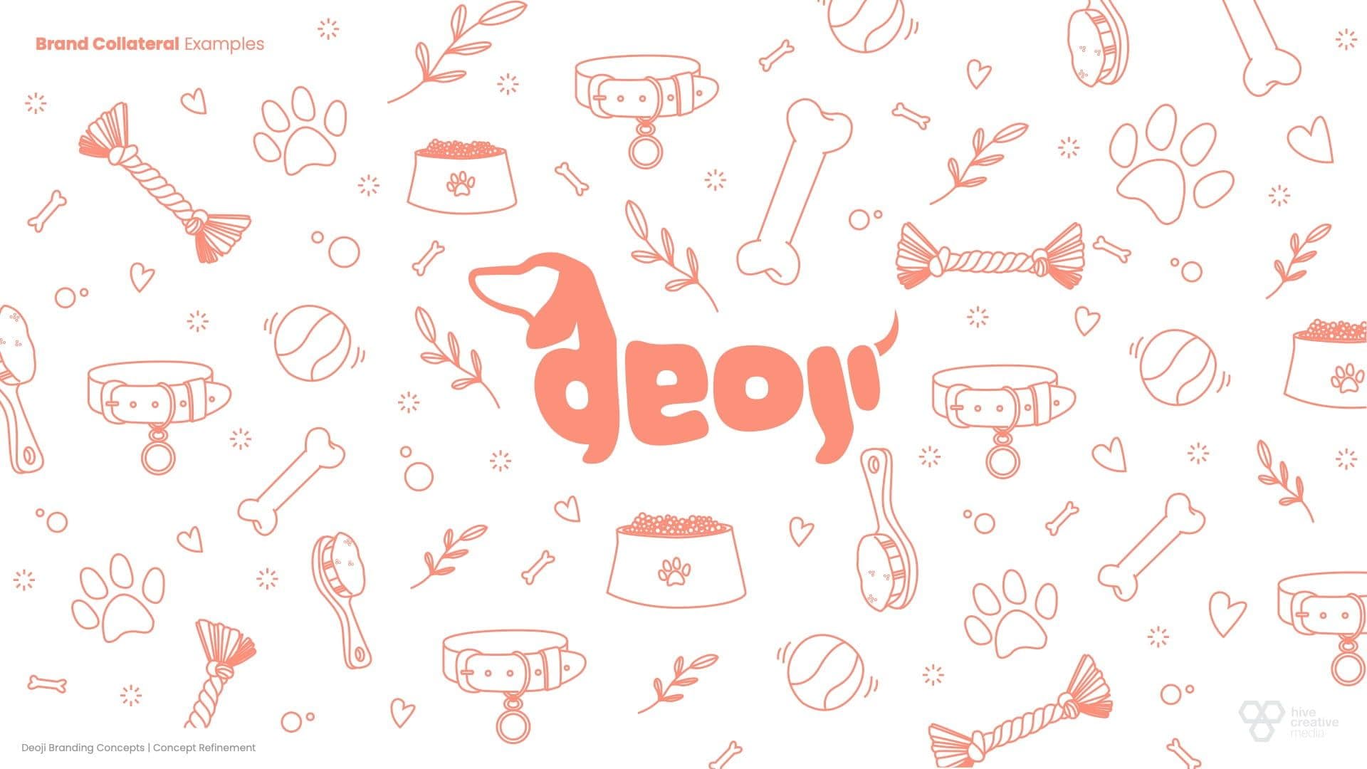

What Deoji does
Deoji is a pet accessories brand built around a simple but compelling idea: pets deserve to be prioritised. Founded in 2024 by someone whose love for her dachshunds turned into a business vision, the brand is designed for owners who treat their animals as family, not afterthought.
At launch, Deoji was exactly where many great brands begin: a founder with a strong instinct, a clear ethos, and a need for the visual language to catch up with the idea. The purpose was sharp, and that was what we had to work with.
That is often where the most interesting creative work happens. No legacy to protect, no existing audience to manage. Just a blank canvas and a founder who knew what she wanted.
How we approached the design
Every good identity starts with questions, not software. What does the brand feel like? Who is it for? What should it communicate about how Deoji sees animals? From those conversations, the first sketches took shape.
Starting Point
Deoji's founder arrived with a clear sense of direction. She knew the tone and themes: warm, friendly, considered but accessible. Using the form of the dachshund as a base, made up of bold letterforms spelling out the name. She needed someone to build a visual system around it. That is exactly what we did.

What We Designed
A primary logo, secondary mark, and logomark, each delivered in all required formats and colourways: primary, reversed, single-colour, and greyscale. Everything a brand needs to show up consistently from day one.

Our Process
Logo design is rarely linear. We worked through multiple concepts, took feedback at each stage, and refined until the mark felt right. The client stayed in the loop throughout; no surprises, no dropped reveals.

Future Considerations
The brief was a logo, but the thinking was always bigger. Every decision was made with future brand growth in mind: a mark that works on packaging, on social, on product, at any size. A solid foundation, not a one-off deliverable.

Ongoing Support
As Deoji grows and the brand evolves, we are here. New touchpoints, new formats, new markets: the identity was built to flex, and we are on hand to help it do so.

What we delivered - a look at the process
A logo suite that does exactly what a good logo should: communicate what the brand stands for, work across every context it will encounter, and leave room to grow. We also put together a set of collateral examples to show the identity in context, giving the brand something tangible to build from. Not everything needs to be built at once. Sometimes the right move is a strong start. Here is a snippet of the concept refinement stage of the process

"Thank you so much for your hard work and for creating a logo that represents our brand so well"

Summary and closing
Not every brief is a full brand system. Sometimes a client knows exactly how far they want to go for now, and the job is to make that feel like a strength rather than a constraint. That is what Deoji asked of us, and it is what we delivered.
A logo that reflects the brand's personality, built for the formats they needed and the growth they are planning. Delivered on brief, on budget, and with room to keep building when the time is right.
When Deoji is ready to expand the identity, the foundation is already there. Good work has a way of making the next step easier.
Logo Design
Studio: Hive Creative
More of our work
A selection of other projects and partnerships we've been part of — from brand identities and websites to campaigns and creative support.

Catching up to where 3XD already was.
A full digital overhaul for a London-based insurance provider: website redesign, broker portal build... Read more

Growify Marketing: Visual identity & design system
Brand identity and design system for our marketing strategy partner, built to scale as their service... Read more

A sharper online presence for Fosse Surveying.
A website refresh for a commercial surveying consultancy, built in parallel with an SEO partner's pl... Read more
Start a project
Interested in working with us? Tell us a bit about what you're building and we'll be in touch.